Pack it
Packaging of principal Colman's products
Most Colman's products were powders. These needed suitable packaging for storage and to allow distribution both in bulk and in smaller quantities. The packaging provided opportunities to place the company name and the product name - as well as the product's virtues and uses - front and centre for delivery people, retailers and consumers. Mustard was packed primarily in casks and tins, and, to a lesser extent, jars. Meanwhile Colman's laundry products, including starch and laundry blue, were well-suited to paper and cardboard packaging. These pages explore the innovative packaging of the principal Colman's products.
Mustard packing
Casks
In the first decades of the company's existence, products were packed for bulk delivery to grocers but reached their final customers in loose form in smaller amounts. Oak casks were the primary bulk packaging. These were stencilled to indicate what they contained: for example, they might list the quality of the mustard powder - from Double Superfine (DSF) to Seconds. The casks also held small labels for the grocer to place in packets for the everyday customers. Casks were so commonly used that Carrow Works saw the introduction of steam cooperage as early as 1870 (though hand cooperage was in operation until 1925). Smaller casks with round labels on the lids were still in use as late as 1938.

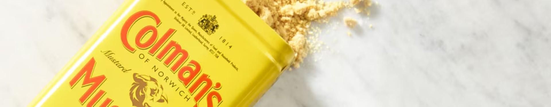
Tins
The mill and factory at Stoke saw the company's first experiments with tinplate. Their first cylindrical tins were advertised by 1852. Except for the ornate decorated tins introduced in 1880, everyday packaging tins changed little over their decades of use. Generally, finer, higher-quality mustards were packed in rectangular tins and lower qualities came in rounded tins. Carrow had its own tin-making department, or tin shop. The hard and hazardous work at the tin shop was done mainly by women.

Printed labels were used on every tin. All labels included the bull's head trademark, the name of the company and the product (for example: 'Colman's Mustard'), followed by the company's medals, awards, and royal crests and warrants.

The various qualities and blends were indicated by subtle colour-coding. Additional information had to be put on labels after the Sale of Food and Drugs Act of 1875, which made trade descriptions compulsory. From then on, a label would say whether the contents were pure ('Warranted Pure') or had been mixed with other ingredients ('Condiment' or, later, 'Compound'). Some of the labels were printed by the Carrow printing department but the majority were produced by external printers, including Sir Joseph Causton & Sons Ltd and the Norwich-based Fletcher & Son Ltd.

Bottles, jars and tin tubes of mustard
Bottles were used for a limited range of powdered mustard. For the packaging of ready-mixed mustard, bottles and jars were primarily used. The most notable products of the prepared mustard range were Savora, a ready-mixed mustard in a squat square jar, and Pic-Nic Mustard, which was packed in a collapsible tin tube and cardboard packet.

Decorated mustard tins
Decorated tins were a form of attractive and practical packaging that Colman's began to release in 1880. Annual releases of tins (issued in September in time for distribution before Christmas) continued until 1939. Colman's tins were characterised by high-quality workmanship; they remained watertight for many years and some are still usable today.

The commissioned designs were printed in reverse on a specially prepared paper and pressed onto the surface of a tin plate. The tin plates covered with designs were then sent to Carrow where they were precisely cut and soldered together to form a container. Labels with more information - for instance, on the quality of the mustard powder - were placed inside the tins, while the company name was inconspicuously placed on the bottom of the tin or tastefully incorporated into the edges of the design. Sometimes labels included advice on further use of the tin, e.g. for storing tea, sugar, rice etc. The finished tins were placed in special protective paper wrappers, many of which replicated the design on the tin.
The special decorative tins released by Colman's at Christmas were not unique, but they stood out for their rich and varied designs and exceptional quality of workmanship. Among the themes explored in the designs were national and imperial identity (tins titled 'Imperial', depictions of national heroes, sea vessels, and colonial and British landscapes); British art (paintings by Sir Edwin Landseer); and even new international artistic movements (Czech graphic artist Alphonse Mucha's 'Seasons').

Colman's decorated tins were - and still are - desirable objects. Originally valued for their beauty and utility, they were kept, used and passed on, and they continue to remind their owners of the quality and status of the Colman's brand.

Oval tins
The 1d and 2d oval mustard tins were invented and introduced by Colman's in 1886. They quickly became sought-after, and the demand was met with increasing efforts to release limited series of decorated penny tins. One of the most outstanding - and curious - themes of the oval tins was the series featuring national flags and emblems, which resulted in stars-and-stripes and even the Russian double-headed imperial eagle decorating English penny mustard tins.

Starch packing
Starch labels
In the company's early days, before 1880, starch was packed in paper parcels of various sizes. Heavy paper wrappers, plain or printed, were also used. Two types of labels were printed to accompany a starch pack: a white label with instructions for use, placed inside the pack, and the coloured outer label, which featured artwork and the company name. Large packs of starch were intended primarily for the laundry trade.

By the 1880s, labelled cardboard boxes became a standard method of packaging starch. This was a direct response to the growing desire of consumers to purchase prepackaged products sold in dedicated and branded containers. Hundreds of thousands of boxes of starch were packed each week at Carrow. Special printed pictorial boxes were reserved primarily for the No. 1 White starch. The 1920s saw the introduction of cardboard cartons, with the product and company names, logos, awards and instructions ready-printed alongside sometimes elaborate artwork. Flags became a very popular design motif in the 1930s. Diagonals were seen as a particularly effective design and the striking red and black starch boxes are an excellent example of this.

Collectible pictorial labels for starch
As part of the company's efforts to create desirable packaging for its products, in the early 1880s Colman's introduced a creative and popular series of pictorial labels for starch boxes. The subjects for the labels were carefully selected and were often released as series. Series included great lives (one featuring Edward VII on the occasion of his coronation in 1901) and Shakespearean characters. Children were entertained by narratives of fairytales, including Little Red Riding Hood, and were able to collect a series of 26 decorative labels depicting the letters of the alphabet. The quest to find the right product packet to complete a collection would continue to be a familiar pursuit for children throughout the 20th century.
The diverting nature of the themed and serialised starch labels succeeded in distracting consumers from the mundane nature of the product. Purchasing a household staple now meant a little bit of added entertainment and interest, for adults and children alike.
Laundry blue packing
Most of the shaped units of blue were wrapped in mauve or blue-coloured paper wrappers, and in some cases (oblong blue and ball blue) the wrappings were printed in blue on white. Blue cylinders were wrapped in squares of calico, tied up with string and circled with a label. These fabric-wrapped blues were destined primarily for foreign markets. Labelled cardboard boxes were the primary bulk packaging for blue. Ready-printed cartons for blue were rare and only used for some batches of No. 1 Azure Blue.

Outer packaging for mustard, starch and laundry blue
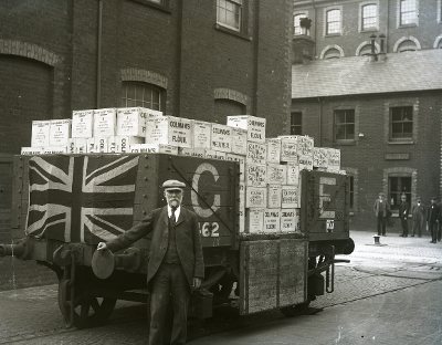
To protect products during transport, wooden boxes were generally used as outer packaging. These boxes were stencilled with the name of the product and the company. Additional detailed and colourful labels - on the outside of the box and inside the lid - provided additional publicity. Many of these boxes have survived, most without their original labels but with the stencil work still present. These survivals are partly due to the sturdiness of the boxes, which also made them reusable. Perhaps the most surprising examples of reuse involved robust containers destined for export.

Solid wooden crates for heavy washing blue were reported to have been used as coffins, while iron tanks for conveying goods on long-haul journeys to Australia and New Zealand were commonly repurposed for residential water storage. The tanks' large blue lettering would have spread the Colman through back yards on the other side of the world.


